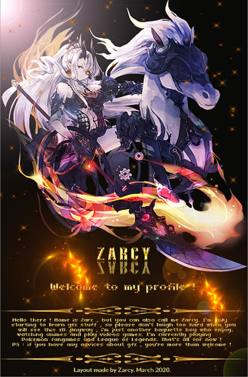
it's pretty cool-looking. I like the lights being colored orange which matches the drawing's flames. Idk if it's because of uploading it here, but I think the whole thing is kinda pixelated? if you can up the image quality, I think that'd be better
The art is flawless and good choice on coloring. The header “Zarcy” seems out of place to me. Increasing the font size and placing it downward a little bit might make it more uniformed.


_600.2127531.thumb.jpg.396f20db3175e08548d3ebd1c45edcf3.jpg)