

Felcatty
-
Posts
188 -
Joined
-
Last visited
-
Days Won
1
Content Type
Profiles
Forums
Events
Reborn Development Blog
Rejuvenation Development Blog
Desolation Dev Blog
Everything posted by Felcatty
-
@Luck Repellent actually fly will work anywhere just press page up/down to change the map
-

Pokemon Glory (in development once again)
Felcatty replied to Swamp King's topic in Resources and Tutorials
@Swamp King @groniack I hope you both had a wonderful Christmas, I know I did so Thank you Oooo ice types, where to begin? Viking looks so cool (no pun intended), its shield looks really well done. For some reason it looks a bit off to me but I can't figure out what it is, might be the face, or the cracks. I don't know why but the eyes don't look like they're the same, that could be due to the colour of the sclera and it's face being very similar in colour though. Snomanos looks cute...that's it, it's just really cute DEEEEEERRRRRRR!!!!... I'm not going to lie, I thought Stagnaroc, Blizzart, and Cryofawn were all in the same evo line. anyway..... Stagnaroc looks amazing, I love it's antlers, makes it seem like it's an electric type, but it also makes it look very majestic in a way, I think the blues and yellow go quite well together. Only thing I can notice is that there seems to be a white pixel you didn't get rid of on the front leg, while the other one has a 'black rectangle' for the outline, which I know is because of the hind leg overlapping it but it kinda looks weird. Blizzart and Cryofawn are adorable, with those red noses I am reminded of Rudolph and it's just passed Christmas so yeah, very cute. I don't know why, but I'm drawn to their tails, so fluffy, I thought the purple gems looked a little weird at first but they're growing on me. You guys are doing a really good job with horns/antlers by the way, it's very interesting to see all the different designs you guys come up with. One thing I did notice however is that the third level of shading (on the hind legs) is really saturated and makes it look flat. I'd try to tone down the saturation it's just too bright for the rest of the body/ies. Other than that, you guys have outdone yourselves again, they look amazing. Keep up the amazing work And until next time... Hope you have a great holiday and a wonderful New Year -
Pokemon Glory (in development once again)
Felcatty replied to Swamp King's topic in Resources and Tutorials
@Swamp King Damn, you guys have outdone yourselves today, let's see... I love the puppeteer mons, from their designs to their concepts, at the moment I think it's safe to say they are my favourite mons you guys have shown us. I want to say they're a ghost/dark type. I love the wispy smoke that emanates from them, I think that's such a cool little detail, the purple and black colour scheme works really well together as well and the red details don't look out of place. I love that their puppets are just black as well with the red details for the helmets, it does give it a more ghost like presence to them. The leone are adorable, I'm going to guess that the one on the left is female while the other is male. Papaya is pretty cool, I love the drool detail and hollow eyes, almost like it's possessed Terrany looks pretty cool Honestly, not a lot to criticize, I think I'm just too captivated by the puppet mons Keep up the great works guys Probably early but hope you guys have a good Christmas -
Pokemon Glory (in development once again)
Felcatty replied to Swamp King's topic in Resources and Tutorials
@Swamp King Larvago is cute, I really like it. I wanna say it's a ground/grass (mabe bug) type dunno why, probably because it's body looks like it's covered in leaves. To me it looks like a cross between a burmy and a nincada. I like the little smirk it has, I think that's adorable that it's trying to be menacing...ok moving on I think the colours blend nicely there's nothing much that stands out, you've done a really good job design wise and it's just pleasing to the eyes. The texture and layers of the body are cool which is again why I think it's a grass type, it looks like it has really flowy grassy fur. I honestly can't really fault it, maybe the head is too straight but for some reason it works for me. Can't wait to see what it's evolutions look like. Keep up the awesome work guys ^,^ -
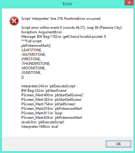
@Silent Chord No, I went directly into the episode 2 folder after copying the files from the patch, it may have been an issue where something in episode 1 just wasn't compatible with episode 2 but I never touch previous episode folders in case something (like this) goes wrong. Regarding the update, I did go to the discord to see if anyone had a similar problem and I did see that one, so I tried reinstalling episode 2 and the patch but nothing changed. Unfortunately discord doesn't work properly for me which is why I stick to forums. I had my suspicions that it was the chocolate smoothie only because I got my furret poisoned but the item never appeared in the bag during battle (the only time I could 'access' my bag). It was after this that I thought of opening episode 1's game.exe to see if I could get rid of new items, and it seemed to work. In all truth I can't really ascertain what the problem is, when I went into episode 2 my bag was working fine but then it decided not to work after I bought: the chocolate smoothie and the water stone. However, it seems like buying those items isn't causing me an issue now. Sorry if this is confusing. Thank you for your help
-
@Silent Chord So I've been meaning to play this for a while, I've had episode 1 downloaded for who knows how long, but now that episode 2 was released I thought 'huh...why haven't I played it yet?' anyways so far I love what you've done, the aesthetics are really beautiful, I've only beaten the first gym leader but still loving it. So there's a really game breaking bug, I bought a water stone from the vendor in the second city to evolve my shiny eevee, but I can't access my bag anymore, I tried all different tricks to get to it; can't open it from the menu, can't give a pokemon an item, and I can't sell anything. The following pops up when I try: Please help, I'd really love to continue playing this game Game.rxdata Edit: I've found the problem, the game wasn't registering the chocolate smoothie I bought in the mart, and I've fixed the issue by reverting back to episode one to get rid of it and then coming back to episode 2. I wish you could fix this for future versions because those types of items are really interesting.
-
Pokemon Glory (in development once again)
Felcatty replied to Swamp King's topic in Resources and Tutorials
@groniack Sure has been a while, sorry that I haven't replied till now but I've finally finished my internship (so happy X3) I would love field effects anywhere, bring on the challenge! Regarding the new mon, I love mythical lores and all that stuff so a minatour is greatly welcome For some reason I found the red quite bright/too saturated, also I don't know what is up with the black lines along the arms, are the separating the arms and acting like elbow-joints or are they extra fingers (confuzzled), speaking of black lines, they're a bit too much. The collar also looks a little funny, to me it looks like it's creating pit hair ( reading over this, my post is very weird today) I've done some edits to kinda show what I mean Keep up the great work guys
-
Pokemon Glory (in development once again)
Felcatty replied to Swamp King's topic in Resources and Tutorials
@groniack Totally understand how life can get, sorry I haven't responded until now, I've got my internship so I'm extremely busy as well. So take as much time as you need guys As for the new mons (fighting type I presume) Lycani is quite cute, I love the scruffy appearance. Lupus feels slightly off to me, I think it could have more shading on its feet and a bit on the collar. I also think the arm on the left looks a little off, maybe make it scruffier like the other one. I love the colour combinations however, the browns and yellows look quite good. Good luck guys Cant wait to play it when you release it Keep it up -
I just go left and right in GDC. Early game though, I didn't care much for hatching eggs, although I still just went left and right in front of the daycare. Don't know if that's the type of answer you're looking for. Im just lazy and I don't want to move away from the daycare people
-
Pokemon Glory (in development once again)
Felcatty replied to Swamp King's topic in Resources and Tutorials
@groniack congrats on finishing your exams I love it when games replace the hm slave, as much as I love having a bibarel/pelliper on my team it's just a waste of space Puppies are adorbs, always, that's just a win right there Saber-tooth cats love em, I love diego in ice age, only character I like in that movie (no offence). I love the armour on it, definitely gives it a fierce look. My initial thoughts before reading was a cougar/puma (thought they were different animals, apparently they're the same....I'm ashamed I didn't know that) so I thought, couten and satoogar .... look I'm no good at names, that was just mindless fun. Nearly every dark type pokemon, I call it midnight, umbreon; midnight, zoroark; midnight, except absol, that's crescent or celeste depending on the gender... I'm not original is the point I'm trying make. critisisms; My main issue is the outline on jedog, the purple tuffs of fur have blue outline (collar, tail, head). I don't know what your going for with the fins, the blue looks a little off for the veins, my only suggestion here would be to try and make them bigger so that the blue can be its own thing, taking another look at it though it may be an issue with the highlight. The blue vein doesn't become lighter with the shading and it just stays flat so it looks a little off, maybe the fins just need a little more shading. Something is putting me off there. The lower half is really light, I think the claws really need a black/dark blue outline. I also feel like the leg 'breaks' away from the body with the dark-light-dark outline, I think just one outline for it would make it look a little better or just darken some of what you already have. I feel like the collar is also a little jagged at the front, but maybe that's just me. Jeez I've really ripped this one apart, sorry. As for the saber, I love it, my only issue with it is that final evo's tail seems too wavy or too jagged that it appears unnatural. That's all I got. Keep up the great work guys -
Pokemon Glory (in development once again)
Felcatty replied to Swamp King's topic in Resources and Tutorials
@groniack Good luck to you all with the rest of your exams. I only had exams on two days in the first week so I've been on break ever since So I don't remember how well detailed I went when I commented on the skill system last time, so sorry if I repeat myself, but if I remember correctly I don't think I commented on points 2-4 so: I like that it's done only with trainer battles so it doesn't get overly spammed with wild battles, not that wild battles are fun after certain periods of time Skill points remind me a lot of the bottle caps in [(ultra)] sun and moon I like that other trainers have them too, it would definitely take the challenge out of it if only the player had them As for the new points: 1. That sounds pretty interesting, I do have some questions - are there different sp. skills based on which skills you choose to lv up or are they set in stone? e.g. would lv. up attack and defender be different to attack and racer? would this lead you to getting all sp. skills eventually? (sorry if this doesn't make sense) 2. Honestly, I have mixed feelings about this. I think it's a nice addition to a unique system but I don't think that it's entirely necessary. - If you guys are implementing gyms, I think the time and space between gyms would be a variable, considering how that system works vs. your system. Too many trainers between gyms might make it too easy in a sense. So do the number of trainers from point A to point B outweigh the bonus from the gym reward? (I don't think I'm making sense, but thank you for reading anyway) - If you aren't implementing gyms, I think that it's a good way to provide players with those stat increases - I also feel like it wouldn't make too much of difference though; I'm probably contradicting myself at this point 3. I like that you have a power effect rather than a luck effect. The closer it would get to 100% accuracy the more likely it is that battles won't become much of a challenge; although with my luck even if you had it at 99.99% I would never get it (games hate players) I think the trainer card layout looks quite clean and simple, so I quite like what you've done so far Well this was long (sorta), sorry if point 2 was confusing. Keep doing great work guys Once again, good luck with the rest of your exams -
Pokemon Glory (in development once again)
Felcatty replied to Swamp King's topic in Resources and Tutorials
@groniack@Swamp King Thank you for the kind words when I was sick; appreciated Eughhh exams.....I know how you feel I have mine starting next week too. Good luck to everyone ^,^ As for the Pokémon: I love the dragonfly line, I'm getting electric/dragon or electric/bug vibes from it but definitely electric. The ant line intrigues me; it's not something I'd see as a Pokémon but you guys have done a great job in it's design. Criticisms: Honestly, not a lot the only thing I can say about the dragonfly line is that maybe the bottom right wing could be a little more rounded like the others; unless it's intentional As for the ant line I can't find faults with it, it's really well done Compared to when you guys first started, these are major improvements; shows how far you've come Once again good luck with everything Keep up the awesome work ^,^ -
Pokemon Glory (in development once again)
Felcatty replied to Swamp King's topic in Resources and Tutorials
@Swamp King Was going to reply sooner, unfortunately I'm suffering from a cold right now but I want to get my thoughts off my chest I really like Dislash's line (I would love to know if there was an origin concept for it because it just looks really cool and I want one), oddly enough I like the fact that it has two claws instead of three, usually having an odd number of something looks more appealing but in this case I would have to disagree because those two claws just complete it quite nicely. As for the other one, it's just one of those meh times for me, but I still like its design, we need more rhino pokemon Criticisms: (I would edit to help show what I mean, but I feel like dirt...null) My only issue with them is that the black outlines are too prominent, I feel like some parts could be lighter. This is more towards the rhino line. Also it might just be me but the stone on the leg near mouth kinda makes it look like it's sticking its tongue out. (Please note: I am delusional while typing this...) The baby Dislash is actually fine though, I don't believe it needs anything. I think the outline of the claws in the final evo could be darkened slightly just to distinguish between them better. I think the back kinda looks funny, is it meant to rugged, if it is I like it, if not maybe make it more curved (?) Great work guys null -
Pokemon Glory (in development once again)
Felcatty replied to Swamp King's topic in Resources and Tutorials
@groniack ughhh well sorry I still find it cute, it probably is intimidating in some way but to me personally I find it cute and I want one. The bat will definitely be something that I use in a playthrough. Although even though I do find it cute, I think the vampiric look also makes it cool. Sprite wise, again I didn't hate the yellow, but maybe you could get more than just my opinion, honestly I think I like the white better but if more people prefer the yellow I'd be fine with it. I do like the rounder body now, but again it's just my opinion. one out of however many you guys get (I hope you get a lot). You know maybe I find it cute because of its round body shape... I'm glad you liked the touched up frog, I wanted to get my post out before I had to leave for uni so I thought I might have rushed it a bit when I was trying to express what I meant. Keep up the great work guys; doing awesome -
Pokemon Glory (in development once again)
Felcatty replied to Swamp King's topic in Resources and Tutorials
The spoiler is just quoting @groniack since half the words on my end got cut off for some reason. So its really only for my benefit of seeing the sentences whole as I type this. Ahhh cute bat it's adorbs I'm in love, I like the vampiric look As for the frog, regardless of whether the suit is real I think the concept is interesting. Would I feel bad for attacking it? No not at all. Criticism wise: With the bat, is the yellow colouration on its feet supposed to represent shoes? I don't exactly hate it but for some reason my eyes are drawn there. Maybe the stomach could be 'rounder' Honestly I find it hard to fault. The frog; the blue colouration for the underside of the lip is quite bright, I'd recommend making it darker with a lower saturation, the same can also be said for the blue on the toes. I think it works well with the face but not with the rest of the body. I think some of the outlines could be darker as well in some places, more around the feet I think: I like the gym leader's design as well, I think the outline for the hair could be a bit darker, or not all the same shade. As for typing, Grass and bug seem obvious so let's change some things up and I'll guess: I'll still go with grass but also ground as well First up, thanks for the credit, I didn't mind if you used it since was just a suggestion for colour, but again thanks. I probably like the sprite on the right just because I like the spots being lighter and more pronounced, but now I need to criticize myself by saying I left purple outline on the tail and ears. You really don't know when you make a mistake until you see it again after not seeing it in a while.
-
@Pozyher
-
@DreamblitzX I've managed to find all 18 pokemon I don't know if you've managed to find the missing ones but based on the list you made these were the following areas that you were missing
-
Pokemon Glory (in development once again)
Felcatty replied to Swamp King's topic in Resources and Tutorials
@Swamp King Personal thoughts: OMG is that a wolf/dog I'm in love with the design <3 (cuteness overload X3) I like the tree design as well but give me an animal and cuteness/coolness and its no competition which I like better Critique wise The green is really bright. Either the saturation is too high, the lighter green needs to be a bit darker, or all of the green/grey needs to be darker. To me the green clashes with the grey spots if I understand that's what you're going for so it seems to me that the spots don't stand out enough and kinda look odd. Also be careful of outlines some of them have purple where it should be green like on the tail (but that's me being picky of the outlines. This is what I would do I have no idea what you would do (high five if you get that reference): Regarding the tree, I think the first two are fine and I quite like them, the final evo to me however looks weird and I don't know why. I think it might be because of the upper arms, maybe they could be longer or the spikes could be larger it feels disproportionate somehow. It could just be me and I'm not that fond of it , I mean I was never fond of trevenant when it was first released either, now I think it's cool even though I never use it...so yeah. That's about it. Overall cool job guys keep up the great work
-
Pokemon Glory (in development once again)
Felcatty replied to Swamp King's topic in Resources and Tutorials
I think to me it's just one of those times where you have two favourites and the other is meh. Not that it's bad I do like the design, makes me think of a torterra and tepig fusion. Maybe more shading, like a third level similar to what you've done with the grass starter, the water one might need it as well? When you finalise the cover I look forward to seeing it -
Pokemon Glory (in development once again)
Felcatty replied to Swamp King's topic in Resources and Tutorials
They look interesting, the grass one looks cool, still having mixed feelings on the fire one, and griffins are quite unique. Although I am curious as to why the water starter is on the title cover; any significance; temporary; aesthetic appeal? Only thing that catches my attention is that the outlines on the grass starter and water starter have dark red outlines in some places, but that's really only minor. -
Pokemon Glory (in development once again)
Felcatty replied to Swamp King's topic in Resources and Tutorials
@groniack My only reasoning for noticing the pixels was because it looked too smooth, yeah that was my only reason I guess I was so captivated by starter cuteness, I didn't mention anything else. For the trainer class feature, I think it's a unique idea that blends the gaming world with the anime world, and I really look forward to seeing how you implement the features. For me the closest thing to this was the amie and refresh features but they become random and solely rely on chance, and I have the worst luck (maxed out; gets a crit when enemy is at red and no other time). Also really liking the main character designs, simple yet effective and the inclusion of a 'light' type to replace fairy sounds quite interesting as well, and it completes the yin-yang concept with the dark type that's already been implemented. -
Pokemon Glory (in development once again)
Felcatty replied to Swamp King's topic in Resources and Tutorials
Oooo wow, so this is the game in development you guys were asking questions for. It looks and sounds interesting. The starters look cute, I'm a bird lover so the water type immediately caught my attention. Although they look nice, I do have a few issues with them: To me the black outlines are really solid and detract from a natural flow, in other words I feel like they section different aspects and it feels like I'm only looking at a single feature rather than the whole pokemon. Some of the outlines in the water's second evo also look a little off to me as well. Something I only noticed with the fire type starter is that sometimes 1x1 pixels are used while other times there are 2x2 pixels. Personally I think the head also needs a bit of shading but that's just me. This is just my opinion, and for your first time doing fakemon, they look good and I know that you're still improving so keep it up.


-
Didn't expect it but nice to see a status thread for v10, take your time and have breaks. @Gheist Don't know if you've played it but Pokémon Apex (currently on build 6) uses that level cap system if you're interested.
-
In a Fakemon Game, is the quality of Fakemon That important?
Felcatty replied to groniack's topic in Resources and Tutorials
I'd definitely give it a try. Of course there's a limit to what you can do, but you can only learn and improve right? I don't believe it makes it entirely unplayable but I find it difficult to get into a game that only has 2D art, without the shading it just doesn't feel right. Regardless, again I'd love to give your game a try if you release it. -
It's an interesting concept, I'll say that much but personally it would feel tiresome unless it was really well incorporated into the plot. I think one time it has great potential, twice is stretching it but I think you could possible get away with it depending on what was going on but not three or more. Again I tend to be a plot person, so if it's interesting enough to keep my attention I'll keep going. Just my opinion


