Felcatty
-
Posts
188 -
Joined
-
Last visited
-
Days Won
1
Content Type
Profiles
Forums
Events
Reborn Development Blog
Rejuvenation Development Blog
Desolation Dev Blog
Everything posted by Felcatty
-
@luis The mouth and tail (?) on the green one looks really off and is actually a little difficult to distinguish, also the shading heads from a yellow directly into a green and it looks off to me. Perhaps sticking more to a yellow or darker shade of green? The black and red one is pretty cool (the colours work well together), but maybe it's the fact that pyukumuku already has shadings of black and red that I actually don't find it all that powerful Just my opinion.
-
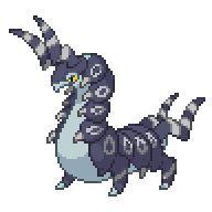
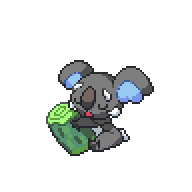
I'm back and I've brought Tapu Bulu with me: Also here's my version of Komala that I did while waiting in Gen 6, just cause komala is freaking adorable (don't want to claim it, I'm too busy after this)
-
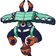
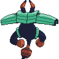
I personally just take my time with the outline and go over it with the pen and fill tools, if I'm outlining a colour like yellow I'd head towards a brownish orange/dark gold, getting the colours I've already used and then making something a bit darker. I also switch out the outline for something like red or blue so I can see what I'm doing as well (black is cool and all but it melds everything together) but that's just me. Well I suppose I'll help out with doing the final Tapu while I'm at it Tapu Bulu: I need to go to uni now so backsprite will come later, but I'm not really sure of the brown colour. Any thoughts?

-
@MOLVEGQ the shading for the white is quite 'harsh.' For white shadings try using ligher colours like light blue or yellow (even making that purple lighter can be effective too) and try keeping the saturation closer to a grey. Taking a look at other pokemon such as seel/dewgong might give you an idea for white shadings.
-
Thanks. Your opinion means a lot, tells me whether or not other people like it; a different perspective
-
I didn't really come up with the style for the Tapus but if you like the colouration Jan I guess I'll put it on Tapu Lele:
-
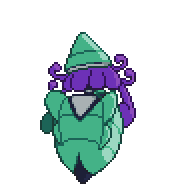
@MOLVEGQ T.K's colours are quite bright to me maybe try a navy blue for the body instead: what do you think? Probably because I'm personally not a fan of that colour green, but the green looks lightly off on Guzzlord, maybe something a bit darker? @DreamblitzX The red one is my fav. Just my opinion.
-
Thanks @DreamblitzX I was quite worried that the green might have been too bright, especially since at this point I'm starting to run out of colour combinations
-
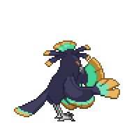
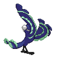
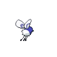
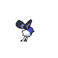
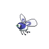
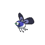
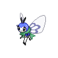
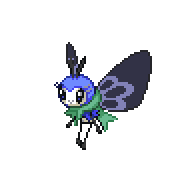
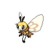
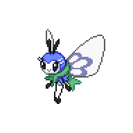
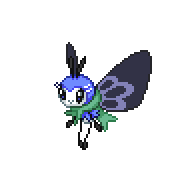
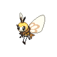
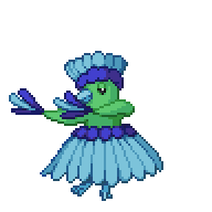
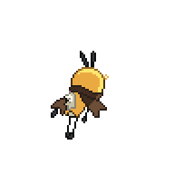
Well, hope Jan gets well soon (sucks being sick in general) I've done quite a bit so I'm putting them in spoiler tabs to reduce space: Oricorio Cutiefly and Ribombee


-
I'd like to try cutiefly line and oricorio please
-
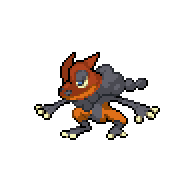
@Might Gai Just wanted to let you know there appears to be a green pixel on frogadier's backsprite
-
Yeah, I see. Sometimes simplicity is best huh?
-
@Sceptilespy No offence but those really look too close to the original sprites to me, except with higher saturation, they look the same to me. Just my opinion
-
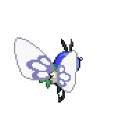
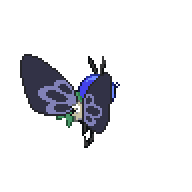
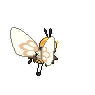
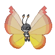
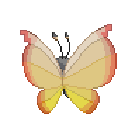
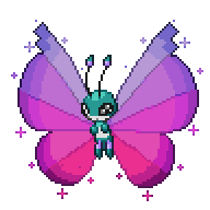
I've been wondering about this myself, should any shiny vivillon have the same body colouration or just whatever we want, should it be a recommendation for consistency purposes?
-
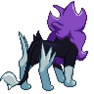
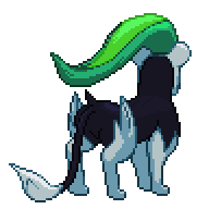
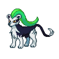
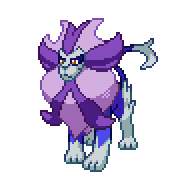
Just fixed up the outline on the Pyroar line since I wasn't entirely satisfied with it:


-
@Amine elhedhili Hey that second one looks really nice, the outlines could be a bit darker but it looks cute and fluffy that I wanna give it a hug. By the looks of it seems like you used graphics gale to do it By the way you can just put @person's name instead of copying the whole post, just thought I'd let you know Just my opinion.
-
@Amine elhedhili Thanks so much My hand actually hurts a bit right about now, cause I had to do the rainbow one, one pixel (2x2 not 1x1) at a time, and I just couldn't make a mistake otherwise if I had made a mistake and not realised, there would have been no way I could have figured out where I went wrong (thankfully a quarter of the way through the front sprite, I had the idea to use black and then change the colour) As for Pyroar, I knew I wanted to do green and purple for the sense of sanctity and nobility, but I definitely had trouble with the body till Jan suggested navy, so I'm glad they turned out the way they did. Just take your time, and everyone on the forum's here to help too if you get stuck. Good luck
-
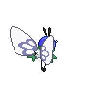
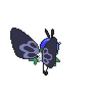
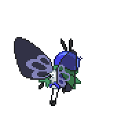
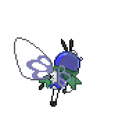
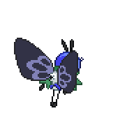
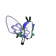
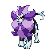
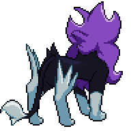
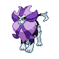
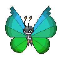
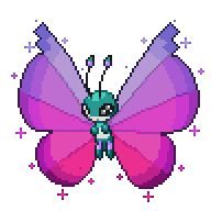
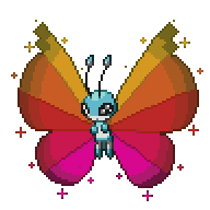
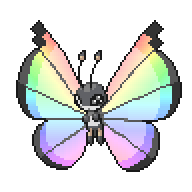
Here is the Pyroar line: And here is my complete version of vivillon: Alright I gave myself a challenge, and I've seen it through to the end: Feeling quite proud actually, not including black and white, 120 colours and 2 hours for each sprite. My best change of gradient ever and I'm not doing it again I consider this rainbow version the shiny sprite but if the body is too generic and rainbow is overkill, the spoiler tab contains the purple version I did earlier. EDIT: On frogadier, I found the head was bothering me, so how bout something closer to a redish brown Actually I noticed some shading differences between the shiny and the original as well as a couple of 1x1 pixels that shouldn't have been there


-
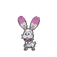
@Amine elhedhili I think the colours look alright together although I really can't tell since the shading is a bit off, for example the face's shading colours should be swapped, and I can't see any shading on its collar. All it really seems to me is that there are 2 really light colours being used, so the pink may have to be a bit darker as well or the white needs to be changed entirely since bunnelby's original colour scheme is that grey silver like colour. e.g. (I just did this using your colour scheme very quickly) Are you using Graphics Gale yet or still on paint? Just my opinion
-
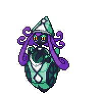
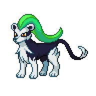
@DreamblitzX I agree with @Hycrox, and maybe it's just me or the saturation that's doing it but I think the colours are quite 'busy' I feel like the green looks a little out of place on the noibat line. There's also a really bright green on Malamar's tentacle-things that should be dulled down a lot. Personally I'm not a fan of the green but maybe it's just me. Just my opinion.
-
Thanks so much Jan. As for my favourite Vivillon though... I like the yellow and purple variations, but I definitely think the rainbow one could be a better shiny (I'm also biased since it was really just a challenge to myself that turned out really nice [it took me about nearly 2 hours to do]) EDIT: Hope these look better: Thoughts are welcome


-
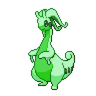
May I make a suggestion on Goodra? Perhaps a lighter green for the lighter purple might make it seem less harsh e.g. What do you think?
-
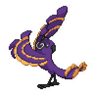
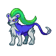
Finally had a little bit of time to do pyroar line: However, I'm not too thrilled with the body colour, maybe it's just me but does anyone have any ideas? My two interpretations of vivillon:

-
Hey everyone ^,^ I'd like to try the Pyroar line if that's alright (I've just gotten sick though and uni work is piling up, so my spriting will probably not be as fast as before)
-
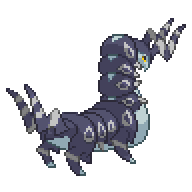
I've been pretty busy but if you want to use the second colouration for the venipede line, here are the sprites, unless of course someone else has an idea for the line: