Felcatty
-
Posts
188 -
Joined
-
Last visited
-
Days Won
1
Content Type
Profiles
Forums
Events
Reborn Development Blog
Rejuvenation Development Blog
Desolation Dev Blog
Everything posted by Felcatty
-
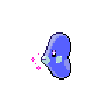
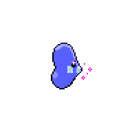
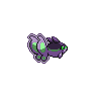
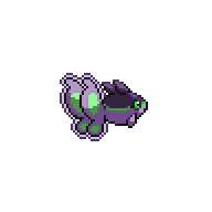
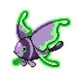
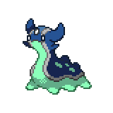
I've gone ahead and updated the Luvdisc sprite cause there were a few errors which I expected since it was the first sprite I did, especially a rogue eye pixel on the backsprite that I don't know how I missed:
-
A shade of purple would be my first choice and then moving it more towards a blue. Good luck!
-
@Siragon I still think you need to change the eye colour, as cool as gold is, the eyes just blend too much with the face making it a little difficult to distinguish them; and the white sclera on shinx also makes it more difficult to distinguish the gold eyes from the face. Don't get me wrong I can see them but it takes me a few seconds to distinguish what is part of the eye and what is part of the face. @Hycrox LOL quoting yourself nice one Personally I like the second one better, but either way really cool flames there.
-
The green has regrown on me but both 'cause I can....and I can't decide either. Does anyone else have any opinions? Male Female

-
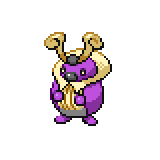
Haha of course, I'm glad you didn't choose the slave one cause it was again just a joke I wanted to do (and I did a terrible job ) I'll get on the backsprites as soon as I can, but the more I look at the green, the less it suited bibarel...so I did another three versions: (Put the first one here so you wouldn't need to look back and forth)


-
Ok cool, I don't really care about the credit though to be honest but whatever works I guess. @ycoder321 thanks for doing the backsprites, yay for teamwork
-
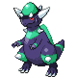
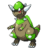
@Jan Aren't you going to use @ycoder321's sprites since they were the original claimer, I made the cranidos and rampardos based off of their colours first but since the sprites were so similar to what they did, they didn't post the sprites. I don't want take away their claim just like that
-
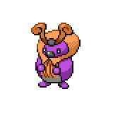
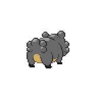
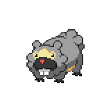
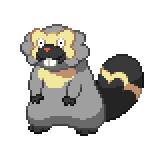
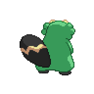
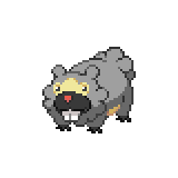
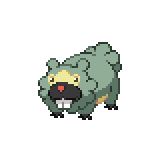
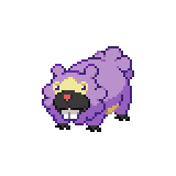
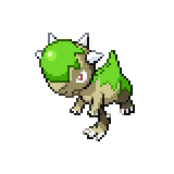
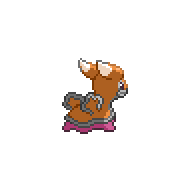
I see that Bidoof and Cranidos will soon have the opportunity to be claimed. So I did the following for fun (I actually don't have any ideas for them and just wanted to test some colour combos out). Feedback is most appreciated. Again, just for fun 'cause I couldn't help myself

-
Participating in the shiny thread has definitely been an interesting experience for me (even if it's only been a month); it's been a lot of fun and I've learnt a lot. I've just been an onlooker for Rejuvenation (and other fan-games), not really giving any thoughts or opinions or anything like that (heck I didn't even create an account until recently), but being able to participate in the public development has definitely given me the opportunity to connect with others. So, I'm quite thankful that I have the opportunity to be apart of the public development/s and if you decide to expand it to other areas I would very much like to try and participate.
-
@KmK I agree with @Alex, although the galaxy head is really cool and amazing (quite frankly it's gorgeous), it's quite out of place, maybe a red or a green would suit it better.
-
Here are the finished versions of Finneon and Lumineon: I've also darkened the aura outline on finneon to keep it consistent with lumineon As well as Shellos and Gastrodon: Any feedback is welcome


-
Would this make it look better: or keep the brighter green and purple:

-
I'm a little confused @Jan I've only been using 2x2 pixels, did I miss something, or is the aura too bright? Sorry I'm confused by what you mean. I'll get on the backsprites right away
-
Here's Finneon and Lumineon: Male Female Any feedback is welcome. Taking on @Anti_Hero's advice I've (hopefully) made the grey on my Togekiss submissions less off Edit: I just did this for fun as well and totally not because there's a chance to claim the Shellos line.


-
Haha don't worry about, it's fine. I appreciate the feedback, I suppose it feels off because it's very light, I'll see if I can mess with it more later. Again thank you for the feedback (and the compliment too ) I think the white tone highlights the claws better and makes them stand out a bit more than the dark one does. That's my opinion. @Anti_Hero I don't have any experience with flames yet so to be honest the flames don't look too bad to me. Since you don't think so though, how about making the third flame from the right head towards the right instead of the left, and maybe making the bottom lines of dark blue the same as the light blue, you know to make it more connected to Dusknoir's body. I don't really know, hope I gave you some sort of idea.
-
I'm half way through the backsprites, so hopefully I can have them done by today (including the female as well)
-
No, the backsprite only has blue spots which I've changed to silver/grey, only the red is yellow. It's simple but that's how I've done and although I could change it to yellow I'd prefer not to in order to keep it consistent. Hope I answered your question. @foznkr Wow, I think you and I have a similar idea for Finneon and Lumineon, this was a sprite a did a while ago too (you can ignore the glow, I was messing with the sprite):
-
@Phi-Bi To be honest the brown is a little off in the Abomasnow (I think it looks out of place), the white could be changed to match the colours you've used (maybe that way the brown won't feel out of place). Yeah...at the moment the white makes it look really unfinished to me (don't worry I'm keeping in mind that you're stuck) it's just too bright. The purple and the pink look nice though. Hope I've helped, if not then I hope I inspired.
-
I've made some minor adjustments on my Togekiss submission:


-
@Phi-Bi If Abomasnow is yours you can start it, you can have two lines to do at a time but you can't claim any more until they have been approved; if I remember correctly, you have starly and snover so you can do both simultaneously but you just can't have any more than two whole lines to do at a time (from my understanding of the rules). As for Togekiss, I'm not entirely sure, I've seen some people only post the Togekiss while other do the entire line. Personally I did the entire line just because once I started doing the Togekiss, I couldn't stop myself and wanted to test the colours I used on the pre-evos as well (just me though). This is just what I think anyway.
-
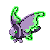
@ycoder321 OMG PRETTY ROTOM. Careful not to make it too similar to Reborn's though (to me the pink is getting close, but it's too pretty that I don't care)
-
@Alex I've messed around a bit with Mesprit and I think because of the bright colours on its face that it will be really difficult for Messprit to pull off the vanilla look, so instead why not this: I also think because of the white sclera that it looked really blurry and bright, but Uxie doesn't have this problem so I believe that the vanilla will look better on Uxie than it does on Messprit. What do you think? @ycoder321 A looks better to me because B seems similar to its original design.

-
@Alex I agree with Hycrox, the colours are bright and meld together too well, giving a blurry appearance, maybe try swapping the white and cream; but that chocolate Azelf is so cute. @Hycrox Munchlax is adorable; mini Totoro
-
@KmK Personally I like the first one, I think the red and green go well together; but the third one is nice too. The second one I feel like the green is a bit too dark (might just be me). Those still look really pretty though.
-
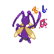
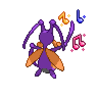
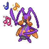
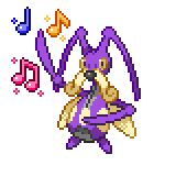
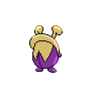
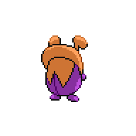
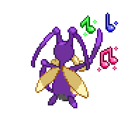
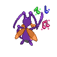
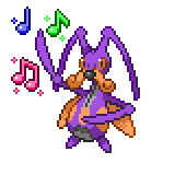
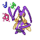
This took me a lot longer to do, there were some things on Kricketune that were bugging me (pun intended), it's eyes looked so weird whenever I looked at it, but hopefully they look alright now (pun not intended). I also hope the moustache doesn't look blurry like before; thanks again to @Hycrox for pointing it out. So here are the finished products of Kricketot and Kricketune: Male Female I felt like the female looked nicer with the orange rather than the yellow; it's also probably because I've used orange/yellow/gold for the note that I feel it was less dominant with the female. Let me know if you think I should swap the yellow and orange colour palettes anyway though. Every time I go to post this I see another tiny error . Edit: I feel as though I've used yellow/orange/gold quite a bit, so I've changed the note to be green, gives it more colour. Hope it looks just as nice: (M)(F)