Swamp King Posted December 7, 2017 Author Share Posted December 7, 2017 2 minutes ago, uberle said: My bad. I thought the fire one was also redesigned, but turns out not. But yeah, the grass is better than before. As said before I think the other two are good. Though being honest Penguson might need a redraw. Bebember is good as is. Thanks for the reply! Seal has said that he likes penguson so if we decide to redesign it as well, we will make few changes like what we did to caleaf. But! Be prepared for some awesome evolutions that (I hope) will not let you down! Quote Link to comment Share on other sites More sharing options...
uberle Posted December 8, 2017 Share Posted December 8, 2017 (edited) Looking forward to them! As well as a recolor for the cover mon. EDIT: So when I wrote 'recolor for the cover mon' and idea popped into my head Well... Here Spoiler Yeah... I did my own recolor. My thought process was that you could make the front, white half have eagle talons and the back, blue half have horse hoofs. Just a suggestion, you don't have to take it. (Though I'd be honored if you did) Edited December 8, 2017 by uberle Quote Link to comment Share on other sites More sharing options...
Noctelis Posted December 8, 2017 Share Posted December 8, 2017 Took a look at the recolor of the cover pokemon, and personally I think it looks better than the original. Quote Link to comment Share on other sites More sharing options...
groniack Posted December 8, 2017 Share Posted December 8, 2017 (edited) 14 hours ago, Noctelis said: Took a look at the recolor of the cover pokemon, and personally I think it looks better than the original. Well, actually we didn't recolor the cover pokemon. We might consider changing it when we reveal it whole. Some parts of it are hidden by our game's logo so you still haven't seen the whole thing Edit: Nevermind, I didn't actually see uberle's work Edited December 8, 2017 by groniack Quote Link to comment Share on other sites More sharing options...
uberle Posted December 8, 2017 Share Posted December 8, 2017 13 minutes ago, groniack said: Well, actually we didn't recolor the cover pokemon. We might consider changing it when we reveal it whole. Some parts of it are hidden by our game's logo so you still haven't seen the whole thing Ummm I think he's referring to what I did Quote Link to comment Share on other sites More sharing options...
groniack Posted December 8, 2017 Share Posted December 8, 2017 1 minute ago, uberle said: Ummm I think he's referring to what I did Oh, I didn't see the edit Thanks for working on it! I really like the white-gold combo in this! Although there is a little issue. I will PM you because I don't want to spoil some things here Quote Link to comment Share on other sites More sharing options...
uberle Posted December 8, 2017 Share Posted December 8, 2017 4 minutes ago, groniack said: Oh, I didn't see the edit Thanks for working on it! I really like the white-gold combo in this! Although there is a little issue. I will PM you because I don't want to spoil some things here Got it Quote Link to comment Share on other sites More sharing options...
Swamp King Posted December 10, 2017 Author Share Posted December 10, 2017 (edited) What? Caleaf is evolving! Spoiler Everyone meet bearleaf the forest bear Pokemon! It is quite aggressive so you might want to keep some distance from it! Anyway! Here it is! By the way! Uberle is now helping with the sprites and is doing a great job especially on the shinnies! You will have access to them later too! Edited December 10, 2017 by Swamp King Quote Link to comment Share on other sites More sharing options...
Swamp King Posted December 19, 2017 Author Share Posted December 19, 2017 And here we go guys! After a long time, we decided to upload something! Penguson got a redesign and in addition it evolved! (for penguson's new design visit the main topic) Meet Pengufon! The flying penguin pokemon! Spoiler Quote Link to comment Share on other sites More sharing options...
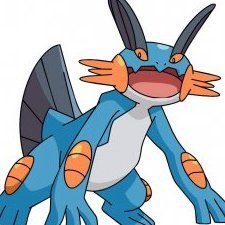
Swamp King Posted January 16, 2018 Author Share Posted January 16, 2018 A quick update! During summer period, it descends from the mountains and sunbathes at the beach. They usually are quiet pokemon but when they get angry, they melt whatever stands in their way. Bebember has just evolved and it starves to meet you! Say hello to the new fellow who just appeared in Ankor Region! Spoiler Quote Link to comment Share on other sites More sharing options...
Felcatty Posted January 18, 2018 Share Posted January 18, 2018 Oooo wow, so this is the game in development you guys were asking questions for. It looks and sounds interesting. The starters look cute, I'm a bird lover so the water type immediately caught my attention. Although they look nice, I do have a few issues with them: To me the black outlines are really solid and detract from a natural flow, in other words I feel like they section different aspects and it feels like I'm only looking at a single feature rather than the whole pokemon. Some of the outlines in the water's second evo also look a little off to me as well. Something I only noticed with the fire type starter is that sometimes 1x1 pixels are used while other times there are 2x2 pixels. Personally I think the head also needs a bit of shading but that's just me. Spoiler Examples of what I mean: It's not perfect by any means but I just wasn't a fan of the black outlines. Also some of the yellows were quite bright and slightly clashed with the white highlight, but that's me being picky about a colour that's tricky to use. Using a 2x2 pixel grid, I can clearly see the different pixels used. From what you've done so far it appears like you're using 2x2. This is just my opinion, and for your first time doing fakemon, they look good and I know that you're still improving so keep it up. Quote Link to comment Share on other sites More sharing options...
groniack Posted January 18, 2018 Share Posted January 18, 2018 16 hours ago, Felcatty said: Oooo wow, so this is the game in development you guys were asking questions for. It looks and sounds interesting. The starters look cute, I'm a bird lover so the water type immediately caught my attention. Although they look nice, I do have a few issues with them: To me the black outlines are really solid and detract from a natural flow, in other words I feel like they section different aspects and it feels like I'm only looking at a single feature rather than the whole pokemon. Some of the outlines in the water's second evo also look a little off to me as well. Something I only noticed with the fire type starter is that sometimes 1x1 pixels are used while other times there are 2x2 pixels. Personally I think the head also needs a bit of shading but that's just me. Reveal hidden contents Examples of what I mean: It's not perfect by any means but I just wasn't a fan of the black outlines. Also some of the yellows were quite bright and slightly clashed with the white highlight, but that's me being picky about a colour that's tricky to use. Using a 2x2 pixel grid, I can clearly see the different pixels used. From what you've done so far it appears like you're using 2x2. This is just my opinion, and for your first time doing fakemon, they look good and I know that you're still improving so keep it up. Thanks a lot for the feedback! I get what you are saying about the black outlines, we will try to get rid of them How did you notice the 1x1 pixels at the fire starter? Lol, I tried to hide it. This one was originally made with 2x2 pixels but it turned out a bit smaller than we wanted. So I just went and resized it. Anyway, thanks a lot for the reply! We will do our best to make them as good as possible. Have you seen the trainer class feature that's going to be included in the game? If so, what are your thoughts on it? Quote Link to comment Share on other sites More sharing options...
Felcatty Posted January 19, 2018 Share Posted January 19, 2018 @groniack My only reasoning for noticing the pixels was because it looked too smooth, yeah that was my only reason I guess I was so captivated by starter cuteness, I didn't mention anything else. For the trainer class feature, I think it's a unique idea that blends the gaming world with the anime world, and I really look forward to seeing how you implement the features. For me the closest thing to this was the amie and refresh features but they become random and solely rely on chance, and I have the worst luck (maxed out; gets a crit when enemy is at red and no other time). Also really liking the main character designs, simple yet effective and the inclusion of a 'light' type to replace fairy sounds quite interesting as well, and it completes the yin-yang concept with the dark type that's already been implemented. 1 Quote Link to comment Share on other sites More sharing options...
groniack Posted January 19, 2018 Share Posted January 19, 2018 @Felcatty Thanks a lot This is actually really encouraging for us to continue our project! Hmmm... those critical hits when the opponent is in red hp is a really common thing, huh? Happens to me all the time, too! Quote Link to comment Share on other sites More sharing options...
Swamp King Posted February 7, 2018 Author Share Posted February 7, 2018 The final evolutions of the starters are here!! I must say they make a pretty good team! Spoiler Quote Link to comment Share on other sites More sharing options...
Felcatty Posted February 8, 2018 Share Posted February 8, 2018 They look interesting, the grass one looks cool, still having mixed feelings on the fire one, and griffins are quite unique. Although I am curious as to why the water starter is on the title cover; any significance; temporary; aesthetic appeal? Only thing that catches my attention is that the outlines on the grass starter and water starter have dark red outlines in some places, but that's really only minor. Quote Link to comment Share on other sites More sharing options...
Swamp King Posted February 8, 2018 Author Share Posted February 8, 2018 2 hours ago, Felcatty said: They look interesting, the grass one looks cool, still having mixed feelings on the fire one, and griffins are quite unique. Although I am curious as to why the water starter is on the title cover; any significance; temporary; aesthetic appeal? Only thing that catches my attention is that the outlines on the grass starter and water starter have dark red outlines in some places, but that's really only minor. Thanks for pointing out these pixel problems. We will fix them! As for the fire one do you think it has a problem with the design or you just don't like it? if you just don't like it, then it is ok xD I don't like delphox as a starter! Everyone has their own preferences! But if you think there is something wrong with the sprite that requires fixing, please help us make it better!! By the way, the cover is just temporary! We didn't have any legendary created at that moment and we messed around with the starters and some backrounds and this turned out the best! When we make a legendary we might change it! Thanks for your comment and for keeping an eye on our progress! It means a lot to have constructive feedback! Quote Link to comment Share on other sites More sharing options...
Felcatty Posted February 9, 2018 Share Posted February 9, 2018 I think to me it's just one of those times where you have two favourites and the other is meh. Not that it's bad I do like the design, makes me think of a torterra and tepig fusion. Maybe more shading, like a third level similar to what you've done with the grass starter, the water one might need it as well? When you finalise the cover I look forward to seeing it Quote Link to comment Share on other sites More sharing options...
Swamp King Posted March 19, 2018 Author Share Posted March 19, 2018 A bunch of grass types have been introduced in Ankor region! There are many more to come! Stay tuned! Quote Link to comment Share on other sites More sharing options...
Youmu9 Posted March 19, 2018 Share Posted March 19, 2018 These don't really look like Pokemon... Quote Link to comment Share on other sites More sharing options...
groniack Posted March 19, 2018 Share Posted March 19, 2018 18 minutes ago, Youmu9 said: These don't really look like Pokemon... Are you talking about all the new ones or are you talking about some of them? It would be nice to know which ones are not like pokemon so as to work on them again... Quote Link to comment Share on other sites More sharing options...
Swamp King Posted March 19, 2018 Author Share Posted March 19, 2018 41 minutes ago, Youmu9 said: These don't really look like Pokemon... Well I'd really like to hear your opinion on what makes a pokemon look like a pokemon! For example let's take a tree pokemon and the one I made and put them side by side! We get this! The one is a real Pokemon and the other isn't. They have similar shape, the differences are: the one has thin hands and body while the other's hands look more bulky and so does the body. So what is so different that makes treevenant look like a pokemon and the other not? Is it the shading? Is it just that it wasn't released by nintendo? Is it that it is not of your liking? Well ... I don't mean to be rude or anything, but I'd like you to help me make these ones look like real pokemon! I will even put your name in the credits if your advice is helpful! Quote Link to comment Share on other sites More sharing options...
Felcatty Posted March 19, 2018 Share Posted March 19, 2018 @Swamp King Personal thoughts: OMG is that a wolf/dog I'm in love with the design <3 (cuteness overload X3) I like the tree design as well but give me an animal and cuteness/coolness and its no competition which I like better Critique wise The green is really bright. Either the saturation is too high, the lighter green needs to be a bit darker, or all of the green/grey needs to be darker. To me the green clashes with the grey spots if I understand that's what you're going for so it seems to me that the spots don't stand out enough and kinda look odd. Also be careful of outlines some of them have purple where it should be green like on the tail (but that's me being picky of the outlines. This is what I would do I have no idea what you would do (high five if you get that reference): Spoiler Regarding the tree, I think the first two are fine and I quite like them, the final evo to me however looks weird and I don't know why. I think it might be because of the upper arms, maybe they could be longer or the spikes could be larger it feels disproportionate somehow. It could just be me and I'm not that fond of it , I mean I was never fond of trevenant when it was first released either, now I think it's cool even though I never use it...so yeah. That's about it. Overall cool job guys keep up the great work 4 Quote Link to comment Share on other sites More sharing options...
Noctelis Posted March 19, 2018 Share Posted March 19, 2018 @Swamp King Personally I think the tree fakemon looks a bit too stiff. You don't really see any joints or difference in limbs and the leafs don't really have to correct shape to be really seen as leafs. Lastly I think the coloration of the tree fakemon should be reversed in the colors of the wood as it looks like the shadows are actually lighter than the fakemon itself. 1 Quote Link to comment Share on other sites More sharing options...
groniack Posted March 20, 2018 Share Posted March 20, 2018 Thanks guys! We will work on the things you mentioned. @Felcatty I really like your color selection for the wolf. We might end up using it @Noctelis It was a bit intentional for the tree to be stiff, since it's a tree and trees are... stiff But if this looks bad, we will edit it! Quote Link to comment Share on other sites More sharing options...
Recommended Posts
Join the conversation
You can post now and register later. If you have an account, sign in now to post with your account.