
It’s summer time and you know what that calls for? A well deserved holiday… I’m british, I’m not calling it a vacation. In today’s development blog we’ll be highlighting updates to Redcliff and Keneph Resort, a project that I was initially working on before I took on the mantle. Let’s get into it shall we?
Redcliff Makeover
With all development cycles for games like Desolation, updates to older parts of the game will happen, and Redcliff was one that needed a bit of a makeover. TL;DR Ruby was like “yeah I’m gonna update Redcliff” and I said “bet”. Redcliff being one of the first towns in the game, we wanted to spruce it up a bit, especially since this is where the research lab is located. It’s a town located in the midst of cliffs… given its name, and right by Keneph Jungle, so we wanted to give off a woodland-esque vibe with a sense of tranquillity, here’s how Redcliff will be looking in EP7!


The starter room just got a little fancier

Once Ruby is set on updating something, there’s no changing her mind, she’s already been doing some makeovers for other areas which you would have seen across previous development blogs, nothing is safe from her pen.
---------------------------------------------------------------------------------------------------------------------------
Outside of Redcliff, we have been working on several new areas of the game, such as Keneph Resort! For this next section, I’ll be passing over to twoslashes to talk through his thought process for tackling the map design for the area.
Take a break at the Resort
Greetings, Deso fans! I’m twoslashes, I joined the Deso team back in February as a spriter and mapper. My main project for the past few months has been the mapping of Keneph Resort, which I recently finished. Further on I'll be talking about my mapping process - how I go from nothing to a full map with a custom tileset, but first, let’s start with some screenshots!


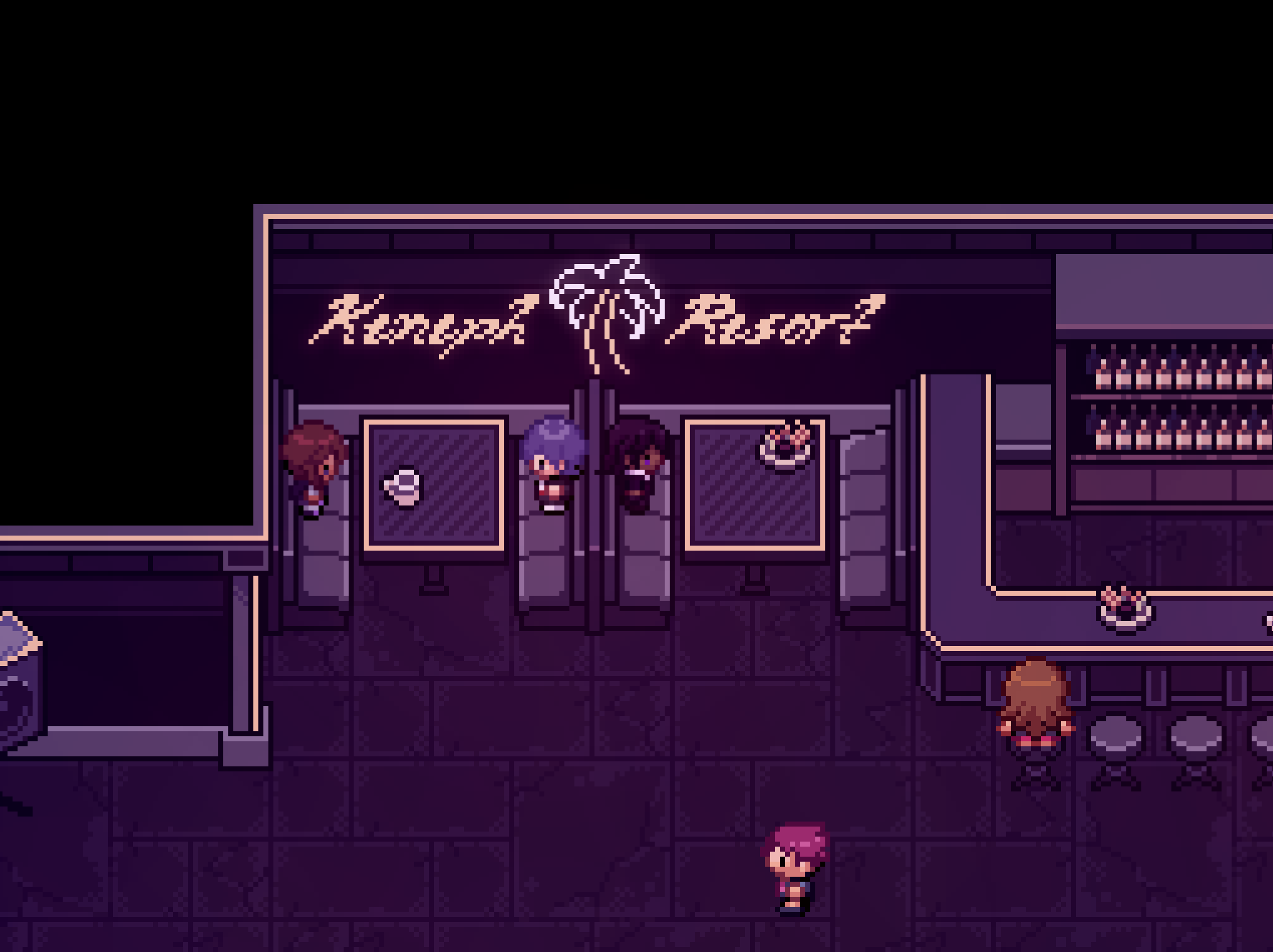


Yeah, I definitely went a bit overboard with some of these. Overall, I’m happy with how they turned out though! I’m especially glad to be done with all the indoor maps, I was really struggling to come up with more indoor layouts by the end. Anyway, for those of you that are interested, I’ll describe my mapping process. I’ll mostly be using the antique shop (Keneph Antiques) as an example, but most of what I have to share is applicable to any kind of map, even outdoor ones.
Firstly - the design. I was provided with a lot of design details for the various areas of the resort, so the general idea was already there and I just had to fill in the gaps. For the most part, the details were not rigid, so I could change them if I didn’t like them or couldn’t make them work, but I stuck to them for the most part. In the case of Keneph Antiques, there wasn’t anything unexpected for an antique shop - wood floor, display cabinets, shelves, a counter for paying. Notably though, it was supposed to have “unique treasures”, and given the nature of the shop, it made sense for them to relate to the history of Ayrith. Those paintings on the walls may or may not be references to historical areas within the game.
Generally, I wanted to give it a bright and approachable atmosphere, packed with stuff to buy. Despite being a new building, I wanted it to have a bit of wear so it could stand out a bit from the other resort buildings. From my observations, I find that antique shops in real life tend to be cluttered, but organized for the most part. Keneph Antiques, however, is a complete disaster when it comes to organization. This is due to sprite size limitations. I found it challenging to display both of these qualities, so I focused more on the clutter since that is more unique to antique shops.
Regardless of whether the tiles are custom-made or not, a map should take into account both level design and visuals. These two aspects aren’t completely independent from each other - you can have a nice looking layout, just as you can use visuals to guide a player around the map, but I think that level design is more foundational. Granted, level design is not as relevant in a small indoor map like this, but it’s still good to do the layout first at least, even when spriting tiles from scratch. It’s quick to do, and is a much greater step towards understanding how the final map will feel than, say, spriting a nice floor tile. My first drafts usually look something like this:
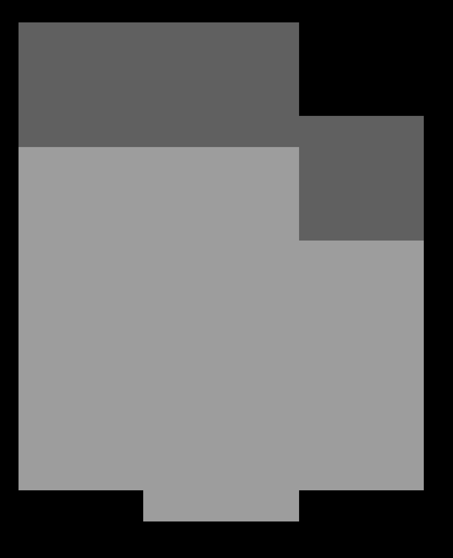
Not an actual progress screenshot of Keneph Antiques, but it probably looked something like this at one point.
Extremely simple, as you can see. It only takes about 20 minutes of experimenting, and it gives a good idea of how the map will feel to run around in even without any proper tiles.
Next I’ll add some mostly undetailed blocks for some of the larger items in the map, and determine the general color scheme:

Compared to the final version, the colors are less polished, and obviously it’s lacking in detail, but it’s very recognizable at this stage. Now, all that’s left is adding all the additional assets and details, which is by far the most time-consuming part of the process. I’m not going to give a full guide on how I made all of the details, but I can give some insight into my workflow and some general advice.
One workflow trick I use frequently is to screenshot the map from RMXP and open it up in my pixel art editor (I use Aseprite for anything tileset-related, but this should work with most programs). The screenshot will likely be at a higher resolution, so I scale it down such that the pixel sizes line up properly. Then you can create the asset directly on top of the map, which immediately gives you full context as to how it’ll look in game without having to add it to the tileset. If you do the layout first, then you can do this for all your assets, which will save a lot of time throughout the process.
I almost always start with the silhouette when making assets. I can take a blob and throw it on top of the map and get a pretty good idea of how it’ll look when it’s actually detailed, which I find more difficult to do with an outline. I also prefer to work in grayscale and color the asset as one of the final steps, mostly because I find the process more straightforward when I can focus solely on one thing at a time. Colors can be swapped cleanly and easily in pixel art, so I don’t find any downside to this workflow. Anyway, the silhouette shouldn’t take long. It just needs to vaguely resemble the object’s shape. For large objects with more organic shapes (e.g. the Milotic statue in the reception, as well as the leaves around it), adjusting single pixels trying to make it look perfect is taking it too far for this stage, because it’s likely that further adjustments will be needed once more detail is present.
Next, I’ll add shading and highlights, still in grayscale. With indoor maps, the light typically comes from straight above, but sometimes I like to put shadows on the side to show the form of the object better (ideally on the side closer to the wall, but for objects used repeatedly it doesn’t matter too much). With small objects, I don’t bother with any cast shadows, since they interfere too much with the form. For larger objects, I start pretty rough, then I refine the shape of the silhouette and the shadows at the same time.

Some antique shop assets, still in grayscale
Finally, it’s time to add color. Working in grayscale encourages having appropriate value contrast between the local color and the shadow color, so I try to keep the contrast consistent between the gray and colored versions. Keeping the grayscale version on the side to reference while adding color to a separate copy can help avoid reducing or overdoing the contrast. Colors are relative - the same color can look different based on context, so I also recommend placing your object on a screenshot of your map when adding color if you haven’t already, mostly to make sure it doesn’t look out of place. That said, I don’t stress too much about having perfect colors yet because they’re easily fixable later on.
Now, that’s where my process ends when it comes to individual assets. However, once I have all assets made (or sometimes a bit earlier if I get bored), I’ll do a phase of color adjustment on the map as a whole. The easiest way I’ve found of doing this is to take a screenshot of the map, edit the screenshot to make it look better, then apply the same edits to the tileset. Lastly, I manually adjust any individual colors that look out of place.
Well there you go, a summary of my entire mapping process. I apologize for not having many examples for the details part, unfortunately I didn’t take many process screenshots while in the middle of making assets. Despite that, hopefully some of you find this helpful, and I hope you’re looking forward to experiencing the resort in-game!
---------------------------------------------------------------------------------------------------------------------------
A massive shoutout to twoslashes for all the work he’s put into what was essentially my baby when we started EP7 development. For those unaware, while Caz was meant to be working on main story, this was going to be my focus on the Episode as it was my idea to build something to bring new life to Amaria as we continue our journey across Ayrith and have an area for players utilise in their playthroughs, from move tutors to the new Fight Club. With Caz’ departure and myself taking over the project, I reviewed the scoop of what we need and decided to delegate this to other members of the team. Seeing how it has now come to life truly brings me so much joy, and I really can’t wait for you all to experience it for yourselves.
In other news before I close out this blog, last month our friends over on the Rejuvenation team have finally dropped their V14 update not too long ago, I would imagine a lot of you might have already played or are in the midst of playing. If you haven’t yet then I highly recommend you checking it out! Jan and his team have put so much effort into it, truly pushing the limits of what was known for Fangames and has honestly given me a lot more inspiration for Deso. So go play this, it’s your homework. :)
https://rejuvenationgame.com/download
That’s all for now folks, til next time!
Posty
-
 19
19
-
 1
1
Recommended Comments
Join the conversation
You can post now and register later. If you have an account, sign in now to post with your account.